
Provision Construction Inc Rebrand
A family owned business based in Snohomish, Washington was looking to expand their reach in the community and showcasing the custom work with every project. Working with this family to establish their brand to help dreams come true.


The Whole Package
Provision had a logo, social media, and a website that needed a little revamping. Talking with Paul and Liz, they wanted to expand their reach in the Snohomish region and on social media so that they could tap into a demographic closer to home. This opened the door to a new visual identity, updated website, and concentrated efforts on social media to create awareness of Provision Construction.


Visual Identity
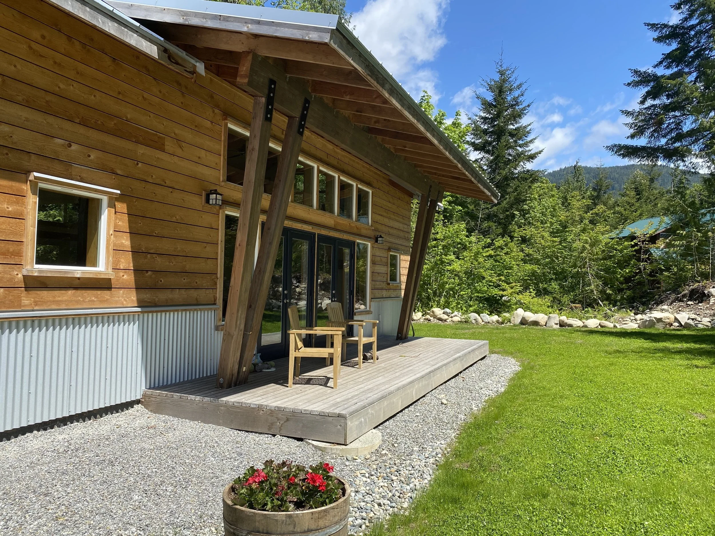
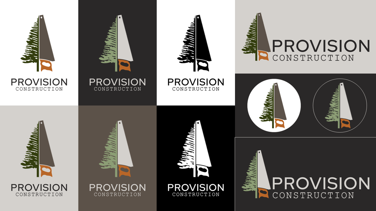
The first step was updating the visual identity and logo for Provision. We began the process by working with Paul and Liz on what was important for them about the community. A common theme that arose for the company was the connection to the PNW and the care they put in to every project. They want to make sure their customers feel supported, and they had a multitude of stories where they were visiting projects from years ago to maintain the craftsmanship of the home.
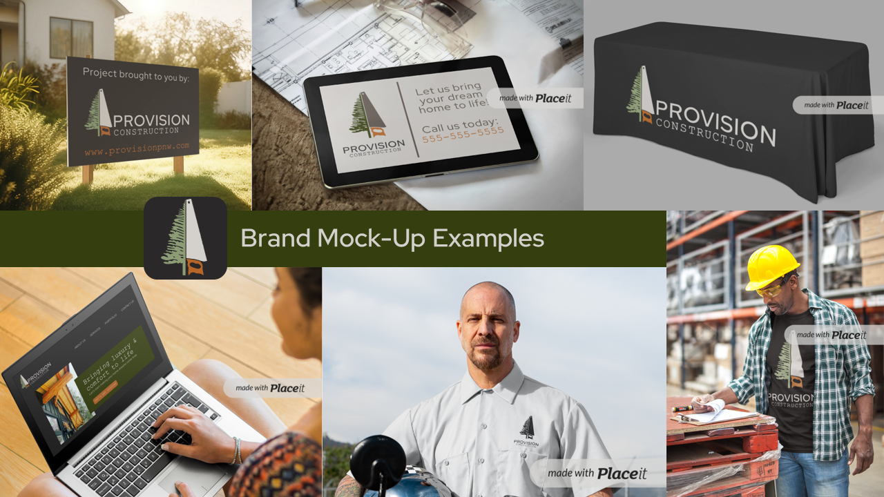
Their story guided us to the final design that focused on the PNW and quality of their projects. An important consideration was that it had to be approachable. We wanted people to see them as a luxury brand, while still being accessible to the everyday person. The tree and hand saw brand mark came out as the favorite that tied in the important components for Paul and Liz. The color pallet built on that with PNW colors and a warm orange that is one of Paul’s favorite colors. This created a basis to print a banner, tablecloth, and other visual aids for company.
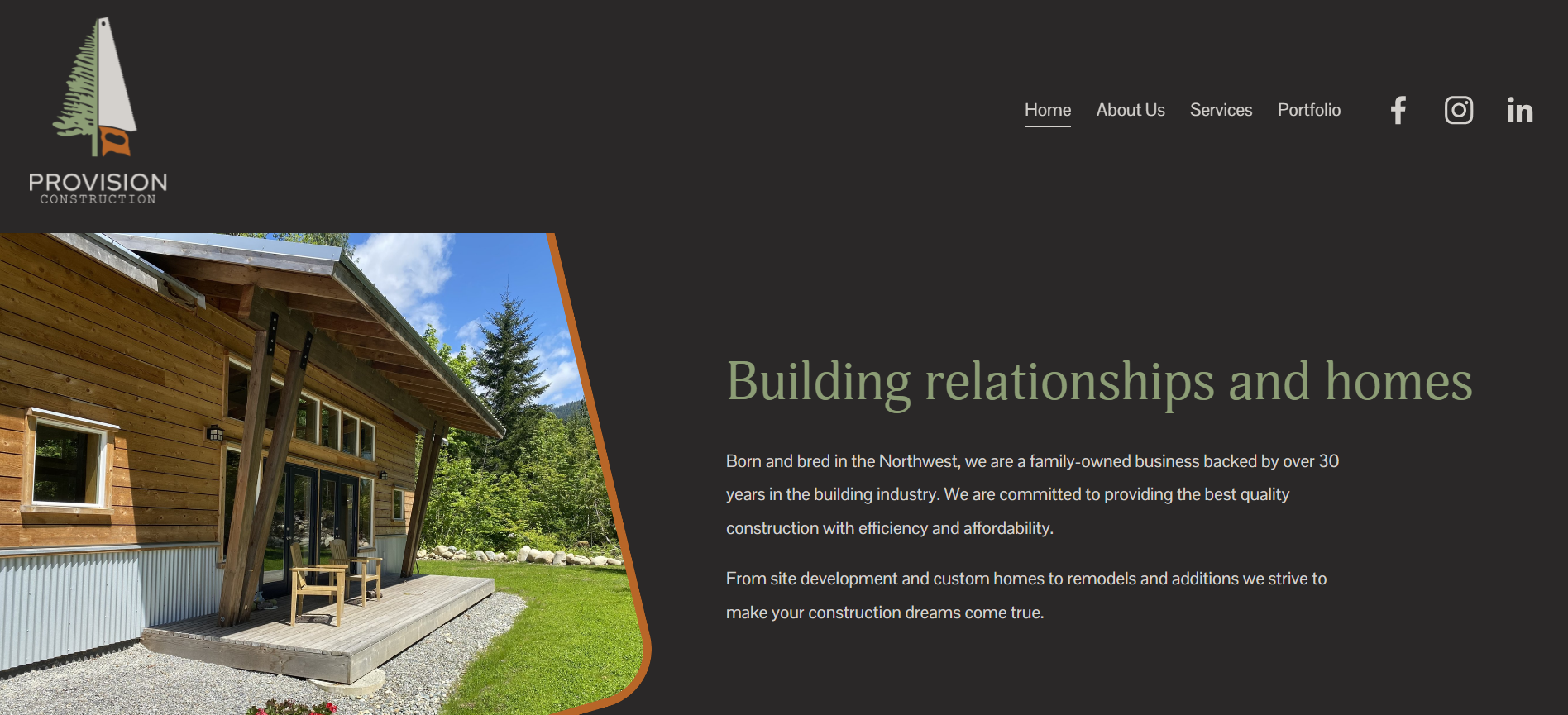


Website
The website, provisionpnw.com had a solid base that took some simple updates to the visual identity and providing more examples to showcase Provision projects. The main point of focus was tying in the colors to the website and making sure it was consistent across every page, including some transition swoops to create a unified look on the website. A project page was also created to categorize projects and different areas of houses to be easier to find for website visitors.
The descriptions for SEO were also updated to increase the search results for Provision. Previously the website was not even on the first page of results when searching for “Provision Construction.” Now it is the first search result when searching in the Snohomish area.


Social Media
The Facebook and Instagram page for Provision Construction had been not well attended too within the past six months before we began helping. During the time from November through December, we created 2-4 posts a week. Posts ranged from static posts, picture carousels, process carousels, and short form videos. The goal was to expand the reach of Provision so that more people would become familiar with the company name. At the end of the time period, the efforts had increased Facebook reach by 64%, Facebook interactions increased by 700%, Instagram reach by 500% and Instagram interactions by 100%.